


Is your school good? Does it successfully educate the children it serves?
In This Lesson

When did California launch the School Dashboard?
What is the California School Dashboard?
What does the Dashboard do?
Who is the Dashboard for?
What do the Dashboard colors mean?
What do the icons on the Dashboard mean?
Which is better, green or blue?
Why is the School Dashboard helpful?
How is the Dashboard different from a school's API score?
How is the Dashboard related to the LCAP?
What does Performance mean on the Dashboard?
What is a Subgroup on the Dashboard?
▶ Watch the video summary
★ Discussion Guide
It's a tough question for many reasons, beginning with a cognitive bias: it goes against human nature to be objective about your own choices.
When you enroll your child at a school, you are making a choice — even if you lack realistic alternatives. As a parent, you want to believe that the school you have chosen for your child — or at least accepted — must be at least OK, right? It's natural to hope for the best.
The California School Dashboard
Classroom grades are flawed measures of academic performance. Just ask students! They know which teachers are tough graders. Fuzzy expectations and rampant grade inflation have made a tough problem worse. It matters. Students and families can easily believe they are doing fine, and it's no fun to tell them otherwise, even if it's true.

In the Ed100 blog
Grade inflation
In 2017, the California Department of Education took a big step to elevate the use of facts to evaluate schools by releasing the first version of the long-awaited California School Dashboard. A combination of factors (including technical challenges and the COVID-19 pandemic) disrupted use of the dashboard in various ways until 2023, arguably the first year it was fully able to work more or less as intended, using two years of data for each school.
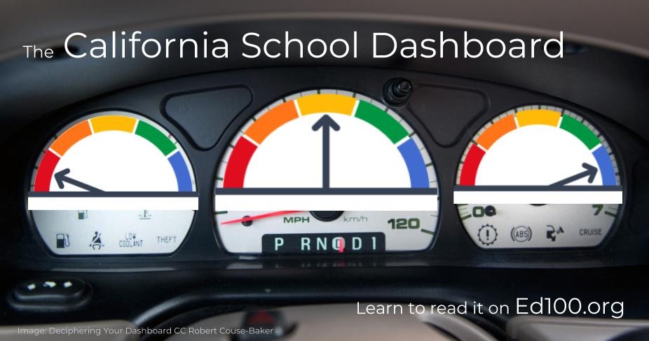
The Dashboard is NOT a single grade or rating. Instead, it is a collection of indicators — a bit like the dashboard of a car. On most car dashboards, a light or message tells you when there might be a problem. To find out more, you have to look into it. Sometimes you have to pop the hood or pull out the owner's manual because, well, cars are complicated. So are schools.
What does the Dashboard do?
The Dashboard summarizes, in several ways, how well your school did last year and the year before that. We explore more about it in this series of posts. The Dashboard is useful for school district leaders, school board members, and PTA leaders because it can help you spot patterns. Within individual schools or across groups of schools, the Dashboard can help you see where the news is good or bad.
The indicators on the Dashboard summarize performance in five color-coded levels. In Dashboard reports, icons accompany the colors, allowing them to be printed in black and white.
![]()
Not every indicator on the Dashboard uses all the colors, but red always indicates a problem. Blue is always best — even better than green.
Why the California School Dashboard Exists
Parents need trustworthy information about schools to make good choices for their kids. Voters want good information to know that schools are working. School leaders need information to help them improve. The indicators on the Dashboard are meant to direct attention where it might be needed, so that you will take a closer look, ask questions, and figure out what to do about it.
Multiple Measures
If the Dashboard seems complex, consider the alternative: it replaced a system that was simplistic. For about a decade, California ranked schools using a single score, the Academic Performance Index (API), based entirely on standardized tests. The API was discontinued in 2014, at the same time that California adopted the Common Core State Standards and reinvented its annual testing.
The Dashboard does not generate an overall score that can be used to compare or rank schools. Instead, it uses multiple indicators related to eight priorities that school districts must address in their annual Local Control Accountability Plan (LCAP). In 2024 California law began requiring that the Dashboard serve as an official point of access for the most recent LCAP for each school district, charter school, and County Office of Education. (Prior to this law, the plans were scattered all over the internet without even a consistent point of reference.)
The Ed100 blog includes more detail about the specific indicators on the Dashboard.
Key concept: Performance
Several of the indicators on the Dashboard share an important similarity: they are meant to show Performance rather than just the most recent status of a measurement. What's the difference?
Performance is Status adjusted for Change
To evaluate Performance, the Dashboard tries to compare how things are (most recent "status" measure) with how they are changing for better or worse. For example, the indicator for graduation rates takes into consideration both the most recent graduation rate as well as the prior year's rate. On the Dashboard, context matters: two schools with exactly the same current graduation rate could show different performance levels on the Dashboard depending on whether that rate seems to be getting better or worse.
When the Dashboard draws your attention, it's an invitation to dig deeper.
Subgroups
Digging deeper means looking beyond averages. The Dashboard can present a big-picture summary of performance in schools and districts, but it can also show filtered views that help you focus on student subgroups. This can help you see patterns. If you are trying to ensure that no students are being left behind, the Dashboard can help you advocate for changes to ensure that all students get the attention and support they need.
For example, schools often look at test scores by grade level, gender, ethnicity, and parents' economic status. School districts also need to know if they are successfully educating students in foster care, learning English, or with special education needs. The Dashboard can show these views, with some limits to safeguard the privacy of individual students.

Lesson 7.9
School interventions
Federal law (ESSA) requires states to provide supportive intervention for the lowest-performing 5% of schools, including analysis of subgroups. In California, Dashboard status is crucial to the process of selecting the schools that receive this support. If you haven't heard about this list of schools, it's intentional. It's in everyone's interest to address low performance quietly and effectively, without shame or blame. Traditional public schools in California cannot be closed for poor performance.
Criticism of the California School Dashboard
The Dashboard, while informative, has no shortage of critics. It was designed with the idea of supporting constructive reflection at the level of schools or districts, but it can be frustrating to unpack insights, especially when looking for comparisons with other schools. Each year, EdSource re-assembles the data into an alternative dashboard that focuses on fewer measures over time. Unlike dashboards in every other state but Kansas, California long prevented the collection or display of true longitudinal data to measure growth in individual student learning from one year to the next. This may change in 2025, improving the tool's reliability and significance.
Perhaps most fundamentally, the Dashboard assembles data awfully late, and at a delay that defeats their purpose. Students first take state tests at the end of third grade. Results arrive some months into fourth grade. Data about year-to-year change arrive some months into fifth grade, by which time the students are on their way to middle school. In practice, schools and districts that want to use data to improve student learning need much more responsive systems that begin in earlier grades. California is scheduled to begin universal screening for risks of dyslexia in 2025-26, but data from these screenings isn't slated to become part of the Dashboard. If your school district is depending on the state Dashboard to spot educational issues and risks, you should be having a pointed conversation with board members about it.
California aspires to create a Cradle to Career data system, but as of 2025 the emphasis has been on college and career.
Go Deeper
Because the California School Dashboard is such an important resource in California's education system, we provide a lot more information about it in the Ed100 blog. Here are some of the major posts, organized as a series:
Context: Ed100 Lesson 9.7
Part 1: Overview
Part 2: The Indicators
Part 3: Performance Colors
Part 4: Math and English
Part 5: English Learners
Part 6: Attendance and Absenteeism
Part 7: Suspensions
Part 8: Graduation
Part 9: College and Career Success
Part 10: "Local" Indicators for School Districts
The pages in the series above may not all be completely current. If you discover issues, please let us know!
Updated May, 2025
Quiz×
CHAPTER 9:
Success
-
Success
Overview of Chapter 9 -
Measures of Success in Education
For Kids and For Schools -
Student Success
How Well is My Kid Doing in School? -
Standardized Tests
How Should We Measure Student Learning? -
College Readiness
Preparing Students for College and Career -
Education Data in California
Keeping Track of the School System -
Achievement Gaps
The Education System's Biggest Challenge -
The California School Dashboard
Measuring California School Performance -
College in California
Options After High School -
Paying for College in California
Are College Loans Good For Students?
Related
Sharing is caring!
Password Reset
Search all lesson and blog content here.
Login with Email
We will send your Login Link to your email
address. Click on the link and you will be
logged into Ed100. No more passwords to
remember!


Questions & Comments
To comment or reply, please sign in .
Carol Kocivar September 5, 2018 at 10:21 am
https://edsource.org/2018/new-friendlier-look-coming-for-californias-school-dashboard/601950