


California's Common Core Dashboard

Math, English, and the California School Dashboard
Part Four in a Series
The Common Core state standards describe what students in California are expected to know and be able to do at each grade level. Schools, teachers and textbook developers use these standards to inform what they teach, when they teach it, and what success looks like.
Each year, California public school students in grades 3-8 take standardized tests based on these standards. Parents receive results in the form of an individual Student Score Report. The state also gathers these results together as indicators on the California School Dashboard.
This post is the fourth in our series about the California School Dashboard. To learn more about the Dashboard, the "indicators" it includes, and how "Status" and "Change" combine to determine color-coded levels of "Performance," please read the earlier posts:
How do individual test scores "roll up" into status indicators?
The California School Dashboard summarizes students' academic performance in Mathematics and in English Language Arts. Performance is based on individuals' year-end test scores and how those individuals improve their scores from year to year.
![]()
The tests for these subjects are known as the California Assessment of Student Performance and Progress (CAASPP). You might hear people refer to these tests as "Smarter Balanced" tests because other states use them, too, under other names. Don't be confused — they're the same thing.
The CAASPP tests are computer-based, and they adapt to each student as they answer questions correctly or incorrectly. The idea is for the test to ask "Goldilocks" questions for each student. Rather than wasting time on questions that are too easy or too hard, the adaptive CAASPP tests try to ask questions that are just right.
For the Dashboard, California has an elegant method for aggregating individual student test scores and individual score improvement. It even works across grade levels and subjects.
Dear reader: If you're content to know that Blue is good, Red is bad, and performance color can vary a lot depending on whether your scores are rising or falling, well, awesome. Just stop here.
 Image: Beware Sinkholes CC Bored Grrl
If, on the other hand, you want to peek under the hood and understand how it works, read on. Our goal for the rest of this post is to equip you well enough that you can explain it to others.
Scaling the test
Let's start by understanding the tests better. By design, some questions on the CAASPP tests are harder than others. Hard questions are worth more than easy ones. Based on the difficulty of the questions that they can answer, students are assigned a four-digit "scaled" score. The score targets rise with each grade level. (Note: most people call them "scale scores" — without the "d" — or just "scores." Now that you know, we'll call them scores. Why be fussy, right?)
The Student Score Report for parents shows their student's score, along with a statistical confidence interval meant to indicate the range of scores that the student might get if they took an equivalent test on another day. (Yes, this interval leaves room for wishful thinking.)
Four-digit scores are daunting, so the report simplifies further. Scores fall in one of four "levels" to represent how they compare with grade level expectations:
- Top scores fall in level 4.
- Scores that meet or beat the target scale score for their grade are are said to be in Level 3.
- Below-standard scores fall in level 2.
- Very low scores fall in level 1.
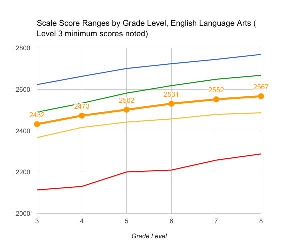
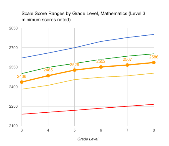
The lowest scale score in level 3 serves an important function on the Dashboard. This score target isn't a fixed number — it varies by test and by grade level, as summarized in the charts below:
English Language Arts - Score Levels by grade (Grades 3-8)
Mathematics - Score Levels by grade (Grades 3-8)
The Difference from Level 3 (DF3)
To summarize academic status across a group of students, such as a school, the Dashboard compares the score of each member of the group to the level 3 target for their grade. The average scale score point distance from this target is poetically known as (wait for it...) "Distance from Level 3." On some reports this is abbreviated "DF3", which isn't a half-bad name for a pop band.
Here's how it works. Suppose every student in every grade in your school were to score exactly at the minimum level 3 score target for their grade level. In this case, the average "distance from level 3" status for your school would be zero. Your's school's status level, by definition, would be medium.
If every student's scale score were ten points above the target for his or her grade level, the average DF3 would be +10 (and your school's status level would be "high"). Does that mean that the performance color would be green?
No, not necessarily. Remember: the Dashboard measures both status and change.
How does the Dashboard summarize change?
An average score ten scale points above the level three mark falls in the "high" status range for both English Language Arts and Mathematics. But the performance color for "high" status can be Orange, Yellow, Green or Blue depending on how this year's score compares to last year's score.
As shown in the charts above, the target scores rise with each grade level, but not in a straight line. The following chart summarizes how much the level 3 target score goes up by subject and grade.
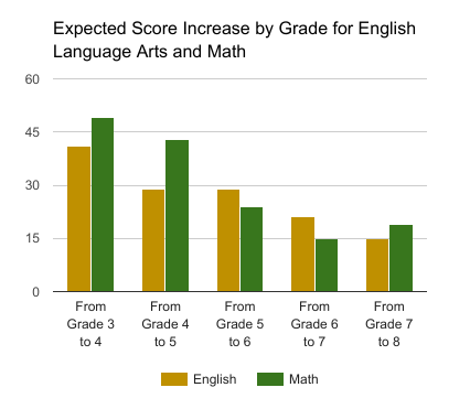
From grade 3 to 4, California expects students to improve their English Language Arts score by about 40 points. The next two years the expectation is to increase by about 30 points. In math, the expected point increases are a bit larger.
These variations in the expected year-to-year score increase aren't terribly important. Why? Because the Dashboard aggregates change for individual students relative to these expected score increases. If each student exactly keeps pace with the expected change from grade to grade, the Dashboard will show that the "change" is zero. On the other hand, if every student improves their scale score by more than the expected number of points over last year, the net change will be positive.
It might help to think of the change in relative score as a measure of momentum. It suggests whether students are falling behind, keeping pace, closing gaps, or extending their lead.
Applying Status and Change to determine Performance
Let's use an example to get comfortable using the Five-by-Five Table for Mathematics below. Suppose that your school's average math score increased by 15 points, placing it 10 points above the Level 3 cut point. What is the school's performance color for Mathematics?
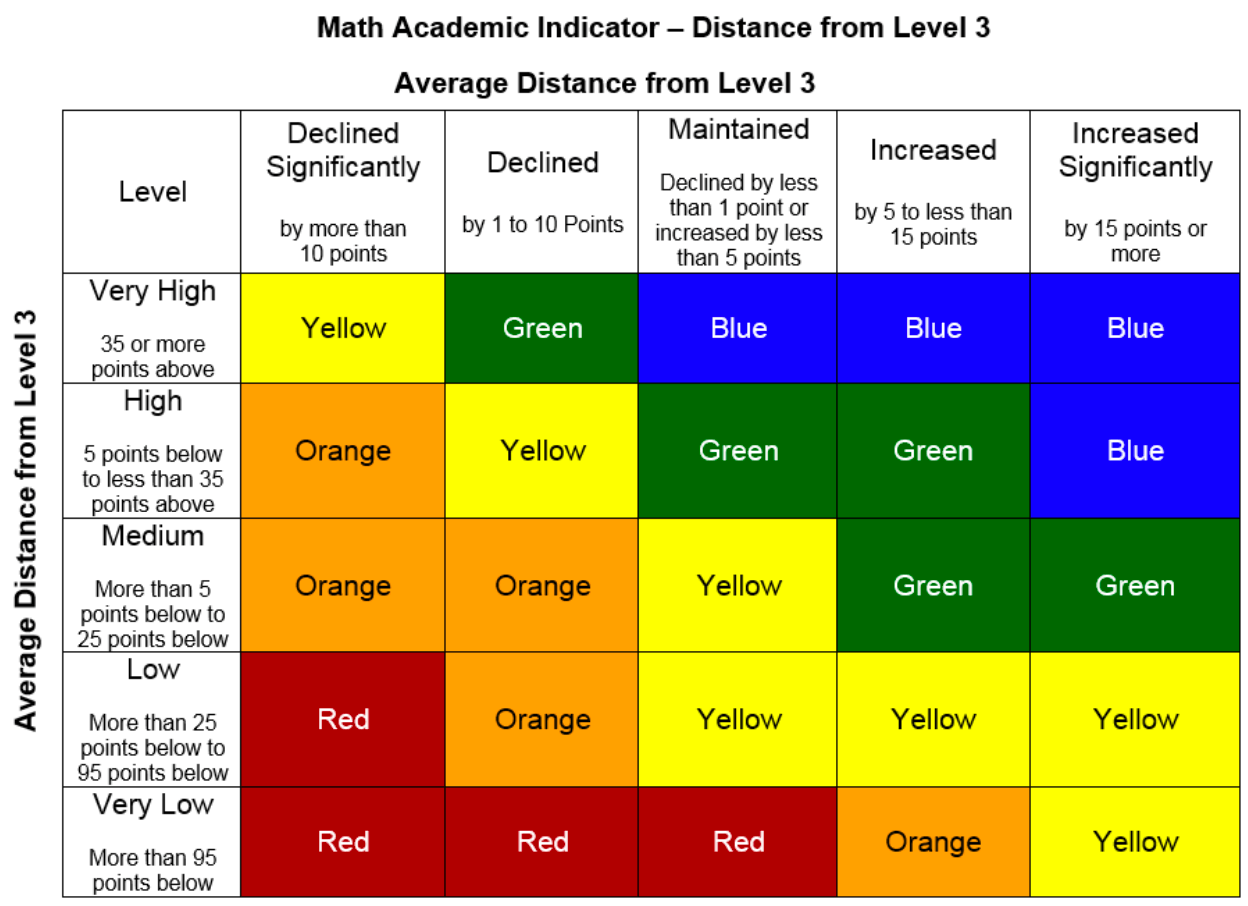
Here's how to tackle it. Your school is 10 points above the Level 3 cut point. On the left side of the table, this matches the description of the "High" row ("5 points below to less than 35 points above"). Now look at the top: your school improved by 15 points, which qualifies it for the "Increased Significantly" column. Congratulations: your school's performance color is blue!
Let's try the same exercise using the English Language Arts/Literacy indicator. We'll use exactly the same numbers: Suppose that your school's average score increased by 15 points, placing it 10 points above the Level 3 cut point. What is the school's performance color? 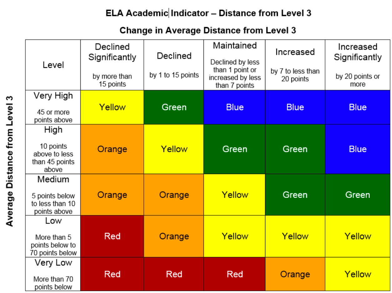
On this indicator, 10 points above Level 3 places your school somewhere in the "High" status row, which means that performance can be Orange, Yellow, Green or Blue depending on how much it changed over the prior year.
Because the score went up by only 15 points, it didn't quite qualify for the "blue" performance level. Because it falls in the "Increased" column for change, the performance color in this case is green.
Whew!
We just popped the hood to inspect HOW the Dashboard indicators work for Math and English Language Arts, referencing the related 5x5 colored tables. If your head is spinning, relax: the Dashboard automatically calculates the performance colors for you. But I hope the exercise has made one thing very clear: Performance on the Dashboard is very sensitive to change. A year of improvement can make a huge difference in the performance rating.
Updated December 2018
Context: Ed100 Lesson 9.7
Part 1: Overview
Part 2: The Indicators
Part 3: Performance Colors
Part 4: Math and English
Part 5: English Learners
Part 6: Attendance and Absenteeism
Part 7: Suspensions
Part 8: Graduation
Part 9: College and Career Success
Part 10: "Local" Indicators for School Districts
Tags on this post
Common core DashboardAll Tags
A-G requirements Absences Accountability Accreditation Achievement gap Administrators After school Algebra API Arts Assessment At-risk students Attendance Beacon links Bilingual education Bonds Brain Brown Act Budgets Bullying Burbank Business Career Carol Dweck Categorical funds Catholic schools Certification CHAMP Change Character Education Chart Charter schools Civics Class size CMOs Collective bargaining College Common core Community schools Contest Continuous Improvement Cost of education Counselors Creativity Crossword CSBA CTA Dashboard Data Dialogue District boundaries Districts Diversity Drawing DREAM Act Dyslexia EACH Early childhood Economic growth EdPrezi EdSource EdTech Education foundations Effort Election English learners Equity ESSA Ethnic studies Ethnic studies Evaluation rubric Expanded Learning Facilities Fake News Federal Federal policy Funding Gifted Grade inflation Graduation rates Grit Health Help Wanted History Home schools Homeless students Homework Hours of opportunity Humanities Independence Day Indignation Infrastructure Initiatives International Jargon Khan Academy Kindergarten LCAP LCFF Leaderboard Leadership Learning Litigation Lobbyists Local control Local funding Local governance Lottery Magnet schools Map Math Media Mental Health Mindfulness Mindset Motivation Myth Myths NAEP National comparisons NCLB Nutrition Pandemic Parcel taxes Parent Engagement Parent Leader Guide Parents peanut butter Pedagogy Pensions personalized Philanthropy PISA Planning Policy Politics population Poverty Preschool Prezi Private schools Prize Project-based learning Prop 13 Prop 98 Property taxes PTA Purpose of education puzzle Quality Race Rating Schools Reading Recruiting teachers Reform Religious education Religious schools Research Retaining teachers Rigor Rubrics School board School choice School Climate School Closures Science Serrano vs Priest Sex Ed Site Map Sleep Social-emotional learning Song Special ed Spending SPSA Standardized tests Standards Strike STRS Student motivation Student voice Success Suicide Summer Superintendent Suspensions Talent Taxes Teacher pay Teacher shortage Teachers Technology Technology in education Template Test scores Tests Time in school Time on task Trump Undocumented Unions Universal education Vaccination Values Vaping Video Volunteering Volunteers Vote Vouchers Winners Year in ReviewSharing is caring!
Password Reset
Search all lesson and blog content here.
Login with Email
We will send your Login Link to your email
address. Click on the link and you will be
logged into Ed100. No more passwords to
remember!


Questions & Comments
To comment or reply, please sign in .