


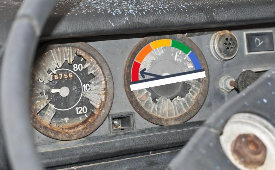
California's School Dashboard Has Broken Gauges
Vital Misinformation
In 2017, the California Department of Education introduced a mechanism to interpret schools’ and districts’ vital signs — the California School Dashboard. Unfortunately, the Dashboard is broken.
 Guest Opinion
Steve Rees
Although the Dashboard starts with facts, it often interprets them using twisted logic and funky math. It often flags districts for underperformance that don’t deserve it. And all too often it fails to notice districts with important problems that deserve attention. This matters because flawed data can lead good people to make bad plans.
Dashboard Confessional
How do I know this? For over 20 years, I’ve led a company that’s helped over 240 California districts understand their schools’ vital signs and explain them to others in their school accountability report cards. As a veteran of the accountability wars, I know that the cost of tarnished reputations is serious collateral damage.
I’m not the only critic of this Dashboard. Some are scholars like Morgan Polikoff (USC Rossier School), who co-authored a review of the Dashboard which was published by PACE in September 2018 as part of the “Getting Down To Facts” research. (Click here to listen to his video summary of its key points.)
Another researcher, Paul Warren, who retired recently from the Public Policy Institute of California, criticized the Dashboard’s illogic in a report published June 2018. Warren’s comments have special oomph because he led the Assessment and Accountability Division of the California Department of Education (CDE) from 1999 through 2003. (Click here to read my blog post about this report.)
Other critics include the 125 districts and 9 county offices of education that have quietly demoted the Dashboard’s place in their plans, and instead turned to the CORE Data Collaborative for higher quality evidence. Our own client districts have also relied on stronger evidence we built for them, comparing their vital signs to those of districts whose students are very much like their own. One client, Morgan Hill USD, won an award for excellence from the California School Boards Association for a plan that effectively disregarded the official Dashboard’s diagnosis, relying instead on their own evidence base.
Combining Status and Change is a Logic Error
Two examples of the Dashboard’s half-dozen flaws are perhaps most troubling. As Ed100 explains in Lesson 9.7, California’s Dashboard combines test scores (status) with a comparison to prior year’s scores (change) and assigns a district a single color (performance) based on both values.
This invites trouble because status and change have no relation to each other. Instead of having two perfectly clear and simple measures, the Dashboard blurs them together, obscuring the meaning of both.
Minding the gaps?
The intended mission of the Dashboard is to draw attention to where it is most needed — especially when it comes to patterns of unequal results, usually called gaps, among groups of students. Unfortunately, the way that the Dashboard has been designed doesn't deliver on this mission. Instead of helping to mind the gaps, it obscures them.
As designed, the Dashboard flags a group of students as needing attention when its performance is two “colors” from the “all students” category. Let’s ignore the loss of evidence that results when scalar measures like numbers are reduced to range-and-frequency bins that are colors. The more astonishing error is including a student subgroup in the larger “all students” group you’re comparing it to. Why not directly compare the two subgroups whose differences are of interest? (The rest of the world follows this convention.) No surprise, that’s exactly what the CAASPP reporting site shows, when you click on this link for Performance Trend Reports and then select “ethnicity.”
As a result, the state Department of Education and county offices of education often focus their scarce resources on the wrong schools. Districts with egregious gaps are not getting dinged by the Dashboard for large gaps in graduation rates and test scores for numerically large subgroups (e.g., boys and girls, ethnic subgroups). Conversely, many districts are getting flagged for gaps for students with disabilities and English learners, due to the small numerical size of those subgroups of students, combined with their understandably lower scores.
The Highway to Help?
The California Department of Education might begin solving its Dashboard dilemmas by calling on Sean Reardon and his team at the Stanford Education Data Archive and the Stanford Center for Education Policy Analysis. How lucky that within 2.5 hours from Sacramento, they can find the social scientists who are leaders in the measurement of inequality in education
Steve Rees, for more than 20 years, has been helping leaders make better sense of their districts’ and schools’ vital signs. He is founder of School Wise Press and leads their K12 Measures team, which is helping district and school planning teams make smarter use of their numbers.Tags on this post
DashboardAll Tags
A-G requirements Absences Accountability Accreditation Achievement gap Administrators After school Algebra API Arts Assessment At-risk students Attendance Beacon links Bilingual education Bonds Brain Brown Act Budgets Bullying Burbank Business Career Carol Dweck Categorical funds Catholic schools Certification CHAMP Change Character Education Chart Charter schools Civics Class size CMOs Collective bargaining College Common core Community schools Contest Continuous Improvement Cost of education Counselors Creativity Crossword CSBA CTA Dashboard Data Dialogue District boundaries Districts Diversity Drawing DREAM Act Dyslexia EACH Early childhood Economic growth EdPrezi EdSource EdTech Education foundations Effort Election English learners Equity ESSA Ethnic studies Ethnic studies Evaluation rubric Expanded Learning Facilities Fake News Federal Federal policy Funding Gifted Grade inflation Graduation rates Grit Health Help Wanted History Home schools Homeless students Homework Hours of opportunity Humanities Independence Day Indignation Infrastructure Initiatives International Jargon Khan Academy Kindergarten LCAP LCFF Leaderboard Leadership Learning Litigation Lobbyists Local control Local funding Local governance Lottery Magnet schools Map Math Media Mental Health Mindfulness Mindset Motivation Myth Myths NAEP National comparisons NCLB Nutrition Pandemic Parcel taxes Parent Engagement Parent Leader Guide Parents peanut butter Pedagogy Pensions personalized Philanthropy PISA Planning Policy Politics population Poverty Preschool Prezi Private schools Prize Project-based learning Prop 13 Prop 98 Property taxes PTA Purpose of education puzzle Quality Race Rating Schools Reading Recruiting teachers Reform Religious education Religious schools Research Retaining teachers Rigor Rubrics School board School choice School Climate School Closures Science Serrano vs Priest Sex Ed Site Map Sleep Social-emotional learning Song Special ed Spending SPSA Standardized tests Standards Strike STRS Student motivation Student voice Success Suicide Summer Superintendent Suspensions Talent Taxes Teacher pay Teacher shortage Teachers Technology Technology in education Template Test scores Tests Time in school Time on task Trump Undocumented Unions Universal education Vaccination Values Vaping Video Volunteering Volunteers Vote Vouchers Winners Year in ReviewSharing is caring!
Password Reset
Search all lesson and blog content here.
Login with Email
We will send your Login Link to your email
address. Click on the link and you will be
logged into Ed100. No more passwords to
remember!


Questions & Comments
To comment or reply, please sign in .
Anna Meza June 8, 2020 at 10:45 pm
jroubanis June 8, 2020 at 5:34 pm
What are some ways that status and change can be aggregated on the Dashboard?
Steve Rees June 16, 2020 at 5:54 pm