


Education Change Happens. Slowly.

Time-Lapse Demography
Big, complex systems DO change. It can be hard to notice.
California stands out as different — and rarely in a good way
Photographers capture slow changes using time-lapse images. Education policy wonks use charts. I have long been a fan and supporter of States in Motion, an interactive tool from EdSource that uses a time-lapse approach to shed light on long-term changes in the conditions of education in America. It incorporates tens of thousands of individual points of public data, spanning all fifty states plus Washington, D.C., since 1970. (Proud disclosure: Back in the day I created the prototype for the early version this tool.)
EdSource extensively updated States in Motion in the spring of 2018.
Using this tool, it is possible to understand the challenges of California’s education system with an unusual degree of big-picture context. Almost regardless of how you look at the data, California stands out as different — and rarely in a good way from the perspective of kids.
Below is a brief summary and snapshot of several charts in the series. To really appreciate them, visit the live version on EdSource.org.
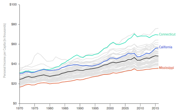
Income per Capita: California is a wealthy state
It helps to start with the basics. You may have heard of Gross Domestic Product (GDP), the measure of a nation's total economic activity. You can measure the size of the economy of each state in a similar way, using an economic statistic called "total personal income". In the same way that GDP per capita is used to compare the wealth of nations, personal income per capita can compare the wealth of states. States in Motion presents all figures in 2016 dollars to adjust for inflation.
The chart below shows the growth of each state's income per person since 1970. California is a high-income state, in terms of average personal income per capita, though other states have caught up. In this chart (and most others in the series), the black line represents the US average excluding California. This is quite intentional: California is so big that it significantly influences the average.
Connecticut (highlighted in green) is a rich state, home to bankers and insurance executives. Mississippi, by contrast, consistently anchors the chart in terms of average income per capita: it is represented by the red line at the bottom of the chart. Can you guess the identity of the line at the top of the stack? Visit the interactive version of these charts on EdSource.org to find out.
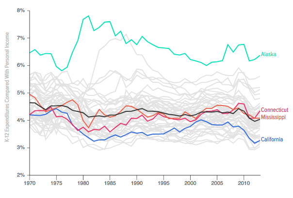
Effort: California Skimps on Education
States with economic wealth have choices about what to do with it. Some collect more taxes than others. Some invest more of those taxes to support education than others do. To measure each state's "effort" to fund education, States in Motion compares expenditures for K-12 education with the total wealth of the state (as described above).
This measure explains a lot. California is a wealthy state, but it is a skimpy funder of education. Mississippi may be a low-income state, but don't knock it for effort: the state invests almost twice as much of its wealth on education as California does. High-flying Connecticut merely expends the same effort as Mississippi does, but it's a higher-income state. Kids make up a smaller part of the population in Connecticut, too, which is an advantage (it has more grownups paying taxes in support of each student).
Alaska's education system benefits from taxes on the state's massive oil and gas industry, but the state in second place on this chart has no such advantage. It just commits more to public education, period. Can you guess the state? Here's a hint: Ben and Jerry. Visit the interactive version of the chart on EdSource to find out.
Note that across the states the level of effort expended to fund schools has gradually trended downward. (Other sectors of the economy, notably finance and health care, have grown faster than education.)
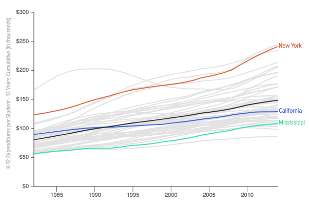
Cumulative Investment: Well over $100,000 per Student
Education is an ongoing investment in each student. Over time, differences add up. In the course of a K-12 education, California's total average investment in each student's education exceeds $120,000. In New York the figure is double the amount.
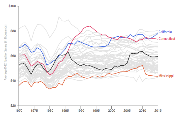
Costs: California Dollars Don't Go As Far
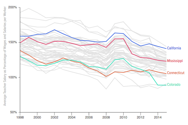
Dollars are only good for what they can buy, and in education the largest cost by far is teachers. Teacher salaries vary significantly from place to place, driven mainly by the cost of living. Salaries are much higher in high-rent places like California and Connecticut than they are in other states. Overall, in most states teacher salaries remain more or less where they stood in the 1970s, adjusted for inflation. Comparing the chart below to the one at the top of this post reveals an important truth: although teacher salaries have generally kept up with inflation, they have not kept up with the growth of the economy.
Wages in Context: Teacher Pay Has Become Less Attractive
In comparison to other employment, teaching still pays better than the average job, the advantage has been shrinking. It varies significantly by state.
Relative pay for teachers is ultimately a function of supply and demand. School districts hire teachers. When they have a hard time filling open positions with good candidates, teacher pay tends to rise. When districts aren't hiring, pay tends to flatten out. When pay for college-educated workers goes up, it tends to decrease the relative attractiveness of the teaching profession in comparison to other employment. Significant changes can lead to teacher strikes and other organized action.
Although relative pay for teachers in California has declined over time, it remains considerably higher than in other states.
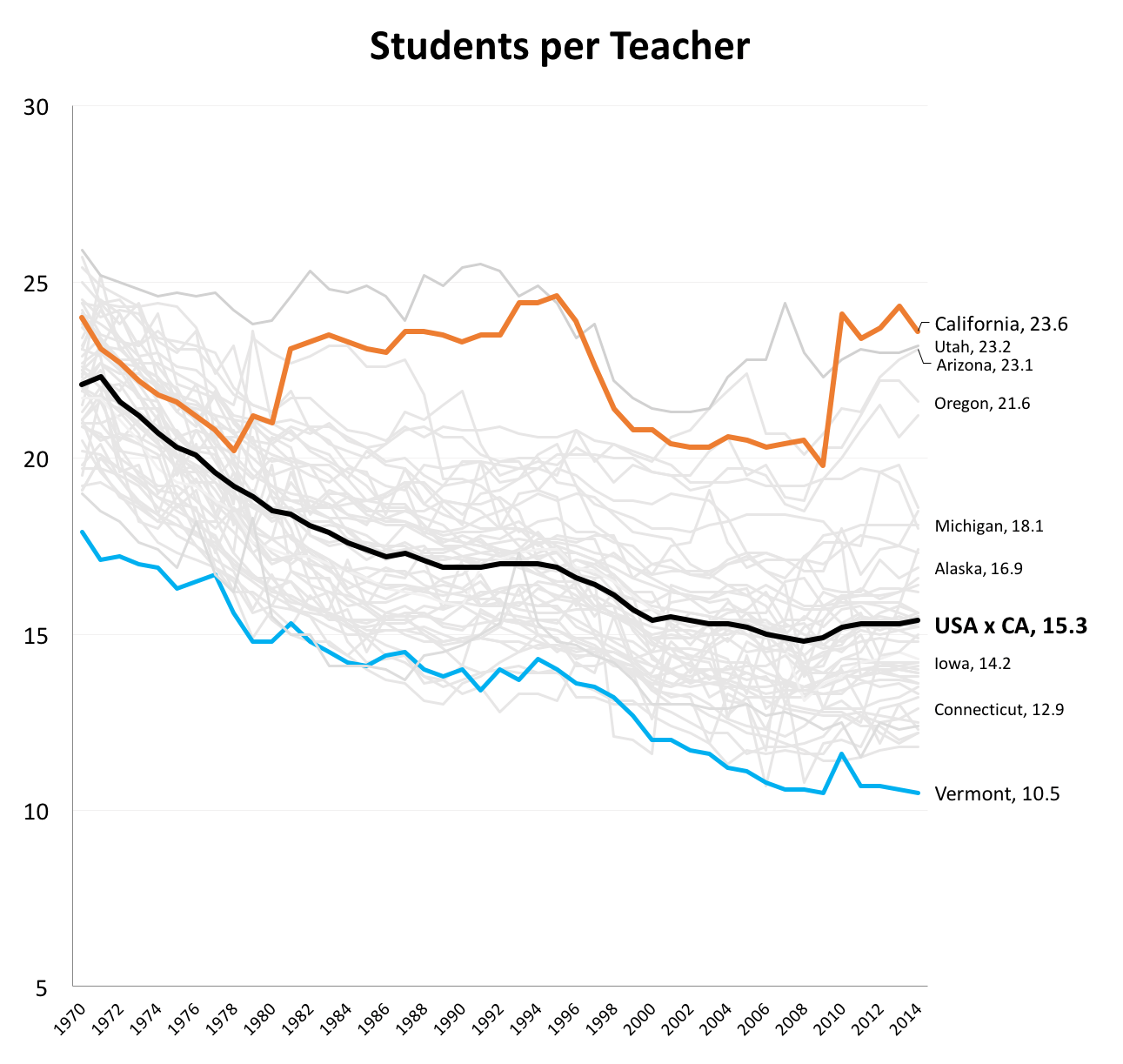
Adult Attention per Student
It's much, much easier for students to slip through the cracks in California's schools.
Most of the money spent on education pays for teachers and the other adults who support students and the functioning of a school. When a state's investment in education is low and the cost of employing adults is high, it means that students get less attention. This comparison is usually summarized as the student-teacher ratio (or somewhat less accurately as class size).
In California and the other western states, there are mobs of students per teacher. In 2014 the ratio rose above 24 students per teacher in California. The average for the rest of the country is about 15 students per teacher, a ratio that allows a completely different set of teaching strategies. California's schools make do with dramatically fewer teachers, administrators, counselors, nurses and support staff than schools in other states, which in general have moved toward smaller class sizes. Again, the effect of the difference is cumulative and harmful.
It's much, much easier for students to slip through the cracks in California's schools.
These updated charts are a preview for readers of the Ed100 blog. They will be added to the lessons in Ed100 over the coming weeks. In total, these charts lay out some of the underlying factors that make California a particularly difficult place to run a school successfully.
Tags on this post
Chart Funding Teacher pay Class size Cost of education EdSource EffortAll Tags
A-G requirements Absences Accountability Accreditation Achievement gap Administrators After school Algebra API Arts Assessment At-risk students Attendance Beacon links Bilingual education Bonds Brain Brown Act Budgets Bullying Burbank Business Career Carol Dweck Categorical funds Catholic schools Certification CHAMP Change Character Education Chart Charter schools Civics Class size CMOs Collective bargaining College Common core Community schools Contest Continuous Improvement Cost of education Counselors Creativity Crossword CSBA CTA Dashboard Data Dialogue District boundaries Districts Diversity Drawing DREAM Act Dyslexia EACH Early childhood Economic growth EdPrezi EdSource EdTech Education foundations Effort Election English learners Equity ESSA Ethnic studies Ethnic studies Evaluation rubric Expanded Learning Facilities Fake News Federal Federal policy Funding Gifted Grade inflation Graduation rates Grit Health Help Wanted History Home schools Homeless students Homework Hours of opportunity Humanities Independence Day Indignation Infrastructure Initiatives International Jargon Khan Academy Kindergarten LCAP LCFF Leaderboard Leadership Learning Litigation Lobbyists Local control Local funding Local governance Lottery Magnet schools Map Math Media Mental Health Mindfulness Mindset Motivation Myth Myths NAEP National comparisons NCLB Nutrition Pandemic Parcel taxes Parent Engagement Parent Leader Guide Parents peanut butter Pedagogy Pensions personalized Philanthropy PISA Planning Policy Politics population Poverty Preschool Prezi Private schools Prize Project-based learning Prop 13 Prop 98 Property taxes PTA Purpose of education puzzle Quality Race Rating Schools Reading Recruiting teachers Reform Religious education Religious schools Research Retaining teachers Rigor Rubrics School board School choice School Climate School Closures Science Serrano vs Priest Sex Ed Site Map Sleep Social-emotional learning Song Special ed Spending SPSA Standardized tests Standards Strike STRS Student motivation Student voice Success Suicide Summer Superintendent Suspensions Talent Taxes Teacher pay Teacher shortage Teachers Technology Technology in education Template Test scores Tests Time in school Time on task Trump Undocumented Unions Universal education Vaccination Values Vaping Video Volunteering Volunteers Vote Vouchers Winners Year in ReviewSharing is caring!
Password Reset
Search all lesson and blog content here.
Login with Email
We will send your Login Link to your email
address. Click on the link and you will be
logged into Ed100. No more passwords to
remember!


Questions & Comments
To comment or reply, please sign in .
PHYLLIS May 2, 2018 at 3:26 pm